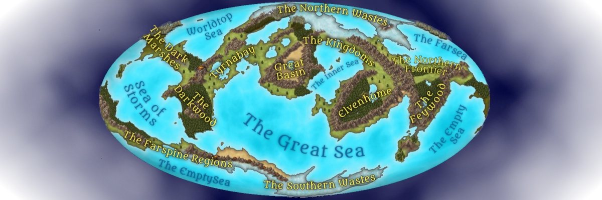
Style Sheet - Kingdoms Region
This is the main body content section (commonly called the vignette). The first letter of the paragraph demonstrates the standard dropcap used for all Cartyrion articles. Article template-specific sections will appear beneath the main contect section. All of the style elements shown here can be activated by simply entering the kingdoms class in the Design | CSS | Additional CSS Classes section of the template.
Font selections are constant across all Cartyrion articles. What changes for each region are the page and panel backgrounds, and the colors for headers, drop-shadows, URL links, etc. Each region of Cartyrion has an associated theme triggered by the specification of a CSS class. Currently, available classes are (none/default), "feywood", "kingdoms", and "tyrnabay".
Font selections are constant across all Cartyrion articles. What changes for each region are the page and panel backgrounds, and the colors for headers, drop-shadows, URL links, etc. Each region of Cartyrion has an associated theme triggered by the specification of a CSS class. Currently, available classes are (none/default), "feywood", "kingdoms", and "tyrnabay".
This is the H1 header
Note that the style provides all initial caps. No other header has this built-in.This is the H2 header
This is the H3 header
This is the H4 header
This is standard text. Any game-specific keywords make use of this style instead.This is a quote block. Quote blocks will be used for all sorts of things in addition to traditional quotes. Anything that needs to be in a panel can use the Quote format, as Panels and Quotes are identically CSSed.
This is a panel designed to contain some sort of warning text (i.e. to tell a reader that spoilers are imminent).
This is the Sidebar: Content Panel Top. Some template-specific entries may display here; others can be manually added.
Key-value pairs entered here are displayed like this:
Key
value
This is the Sidebar: Content Panel Bottom. Some template-specific entries may display here; others can be manually added.
Key-value pairs entered here are displayed like this:
Color Palette
used for titles
used for drop shadows behind panels and some titles
used to highlight "moused hover" text in links and tooltips
This is a panel designed to stand out a little more. It has a border. It can be used either in sidebar or in the main body section.


Comments